NFL helmets
An NFL helmet is the most important part of a uniform in any sport. Not only does it protect a player's head, but the helmet is the most visible part of a player during the game. You're watching 22 individuals, but what you really see are 22 helmets on bodies. So getting them right is especially important.
Everyone has an opinion about helmets, and I have no illusion that mine is better than anyone else's, so I'm not going to try to rank them. Instead, I want to categorize them into four broad groups -- some of which I definitely think are better than others -- and comment on each group.
These helmets suffer from a lack of imagery. Count me among those who will never understand why Cleveland insists on playing with plain orange helmets -- a "B" would be better. Otherwise, these helmets consist chiefly of text, which is just not something that grabs the viewer. (Tennessee makes a vague effort toward an icon, but without really achieving it.) Admittedly, some of the team nicknames don't give you much to work with: Packers, Titans, Giants, 49ers, and Browns. But Bears and Jets? Come on, guys, those could make for some great helmets.
A helmet is not a good place for an elaborate drawing: it's a small space and will be seen from a distance, so keep it simple. Teams have been moving away from this type of helmet: the Dolphins' logo until last year would have qualified, as it pictures a dolphin wearing a helmet (?), and the old New England Patriots' logo of a Continental soldier hiking a football was horrible. (Others old helmets that were too complicated include Tampa Bay and Denver.) The Raiders' and Redskins' helmets aren't too bad, but they could still be better. For the Raiders, how about just the crossed sabers, or just an eye patch? For the Redskins, the feathers are the most interesting part of the logo. Putting feathers on the helmet like a headdress would be very appealling.
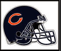
The majority of teams in the league have basic iconic emblems on their helmets, which I consider better than the too simple or the too complicated types. Some of them verge on the too complicated: the cardinal would be better with fewer details, and the jaguar is overdone. I don't particularly care for Pittsburgh's logo, but it has a specific reference outside of football. The raven is good but could do without the B -- are they afraid we won't know where they're from if they don't give us that hint? Kansas City's almost falls into the "too simple" category, but the arrowhead is a great icon (which would work without the KC). New England did a good job with its updated logo. I am particularly fond of New Orleans, Atlanta, and Detroit. Dallas's helmet is about as simple as it could be, but they did a great job of taking a difficult nickname and turning it into an easily recognizable yet meaningful logo.
These four teams have helmets that are basically like the iconic logos of type III, but with the addition that the art integrates into the helmet naturally: the Viking horns come out of the helmet just as we would imagine a real Viking helmet to do, the Rams have horns just as if they were a team of real rams. The Eagles' wings don't totally fit -- eagles don't have wings on their heads -- but the way they incorporated the wings into the helmet is nevertheless suggestive and much more interesting than if they had just had an image of a wing on the side of the helmet. The Bengals' helmet is my personal favourite: instead of drawing a tiger, they put the tigers' stripes right on the helmet. Very easy to recognize, immediately obvious what the black stripes on orange represents, and it conveys a sense of transforming the players into tigers rather than just being represented by tigers. I like the Vikings' helmet, but it took me probably 20 years of following football before I realized that the white swoosh was supposed to be a horn and not just an artistic flourish. Okay, I'm slow, but if they had made the horns curve forward, it would have been much more clear.
Everyone has an opinion about helmets, and I have no illusion that mine is better than anyone else's, so I'm not going to try to rank them. Instead, I want to categorize them into four broad groups -- some of which I definitely think are better than others -- and comment on each group.
Type I: Too Simple
 |
 |
 |
 |
 |
 |
 |
These helmets suffer from a lack of imagery. Count me among those who will never understand why Cleveland insists on playing with plain orange helmets -- a "B" would be better. Otherwise, these helmets consist chiefly of text, which is just not something that grabs the viewer. (Tennessee makes a vague effort toward an icon, but without really achieving it.) Admittedly, some of the team nicknames don't give you much to work with: Packers, Titans, Giants, 49ers, and Browns. But Bears and Jets? Come on, guys, those could make for some great helmets.
Type II: Too Complicated
 |
 |
A helmet is not a good place for an elaborate drawing: it's a small space and will be seen from a distance, so keep it simple. Teams have been moving away from this type of helmet: the Dolphins' logo until last year would have qualified, as it pictures a dolphin wearing a helmet (?), and the old New England Patriots' logo of a Continental soldier hiking a football was horrible. (Others old helmets that were too complicated include Tampa Bay and Denver.) The Raiders' and Redskins' helmets aren't too bad, but they could still be better. For the Raiders, how about just the crossed sabers, or just an eye patch? For the Redskins, the feathers are the most interesting part of the logo. Putting feathers on the helmet like a headdress would be very appealling.
Type III: Iconic
 |
 |
 |
 |
 |
 |
 |
 |
 |
 |
 |
 |
 |
 |
 |
 |
 |
 |
 |
The majority of teams in the league have basic iconic emblems on their helmets, which I consider better than the too simple or the too complicated types. Some of them verge on the too complicated: the cardinal would be better with fewer details, and the jaguar is overdone. I don't particularly care for Pittsburgh's logo, but it has a specific reference outside of football. The raven is good but could do without the B -- are they afraid we won't know where they're from if they don't give us that hint? Kansas City's almost falls into the "too simple" category, but the arrowhead is a great icon (which would work without the KC). New England did a good job with its updated logo. I am particularly fond of New Orleans, Atlanta, and Detroit. Dallas's helmet is about as simple as it could be, but they did a great job of taking a difficult nickname and turning it into an easily recognizable yet meaningful logo.
Type IV: Integrated
 |
 |
|||
 |
 |
These four teams have helmets that are basically like the iconic logos of type III, but with the addition that the art integrates into the helmet naturally: the Viking horns come out of the helmet just as we would imagine a real Viking helmet to do, the Rams have horns just as if they were a team of real rams. The Eagles' wings don't totally fit -- eagles don't have wings on their heads -- but the way they incorporated the wings into the helmet is nevertheless suggestive and much more interesting than if they had just had an image of a wing on the side of the helmet. The Bengals' helmet is my personal favourite: instead of drawing a tiger, they put the tigers' stripes right on the helmet. Very easy to recognize, immediately obvious what the black stripes on orange represents, and it conveys a sense of transforming the players into tigers rather than just being represented by tigers. I like the Vikings' helmet, but it took me probably 20 years of following football before I realized that the white swoosh was supposed to be a horn and not just an artistic flourish. Okay, I'm slow, but if they had made the horns curve forward, it would have been much more clear.

Comments
Post a Comment